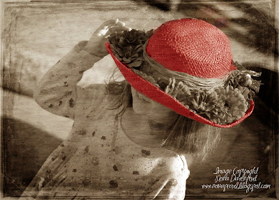
I took the same photo as before (already "grungified") and did some hand tinting (like you see in old fashioned photos). You have to create a new layer, color over your image with a brush, and then set the layer to soft light. This allows the textures of the photo below the tinting (ie - the straw hat) to show through.

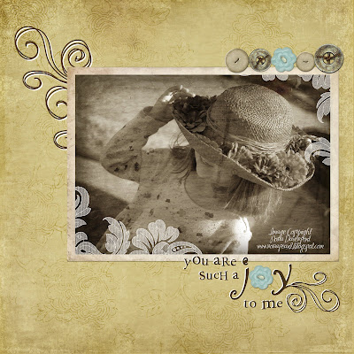
Here is the first "grungy" photo with a Jessica Sprague frame (freebie from the class). I made a quick 12x12 layout with it, and included a texture over my background paper. It is very subtle and not truly noticable until you see the paper without it. Then I added a random assortment of buttons, and this cute quote from the RPenn"express yourself" kit. I recolored it to brown and also to white, then layered the two to give an illusion of outlining. Then I replaced the "o" in "joy" with a button. The swirls on the left are just a copy of the journaling layers I created with the words erased. So fun and quick!
.jpg)

5 comments:
This is beautiful! I need to take another class from JS!
Precious photo! I love the different versions of it.
What neat things you can do with software. The layout looks great.
Nona, your pics turned out fantastic! BEAUTIFUL! Don't ya just love that class?! Great job!
Gorgeous job on the photo editing and the layout. Absolutely beautiful.
Post a Comment